Amazon & Flipkart Sale Design Study | Design Analysis | User Flows
Case study on Amazon and Flipkart sales UX/UI – analysis of design, user flow, strengths, problems, and suggestions for better shopping experience.
Year
2025
Service
Research
Category
UX Research
Tool
Figma

Introduction
Big sales like Amazon’s Great Indian Festival and Flipkart’s Big Billion Days are very popular in India. Millions of people shop during these events, and the success depends a lot on how the user experience (UX) and user interface (UI) are made.
In this case study, I am looking at how both platforms design their apps and websites during sales, what works well, what does not, and how things can be improved.
How I Did the Research
Checked both websites and apps during sale time.
Took screenshots of main screens: homepage, product page.
Noted down design patterns for usability, speed, and clarity.
Focused on mobile experience, since most people in India shop from phones.
User Experience (UX)
1. Shopping Flow
Amazon: Easy steps from homepage → Banner → Sale Page → product → cart → checkout.
Flipkart: Same Flow of homepage → Banner → Sale Page → product → cart → checkout. and trending or recommendation products on the landing page.
2. Easy to Use
Amazon keeps the design simple and familiar as the normal day landing page.
Flipkart shows there best deals and BBD Sale Keeping Design of the landing page similar.
Both Amazon and Flipkart use a Sale Landing Page
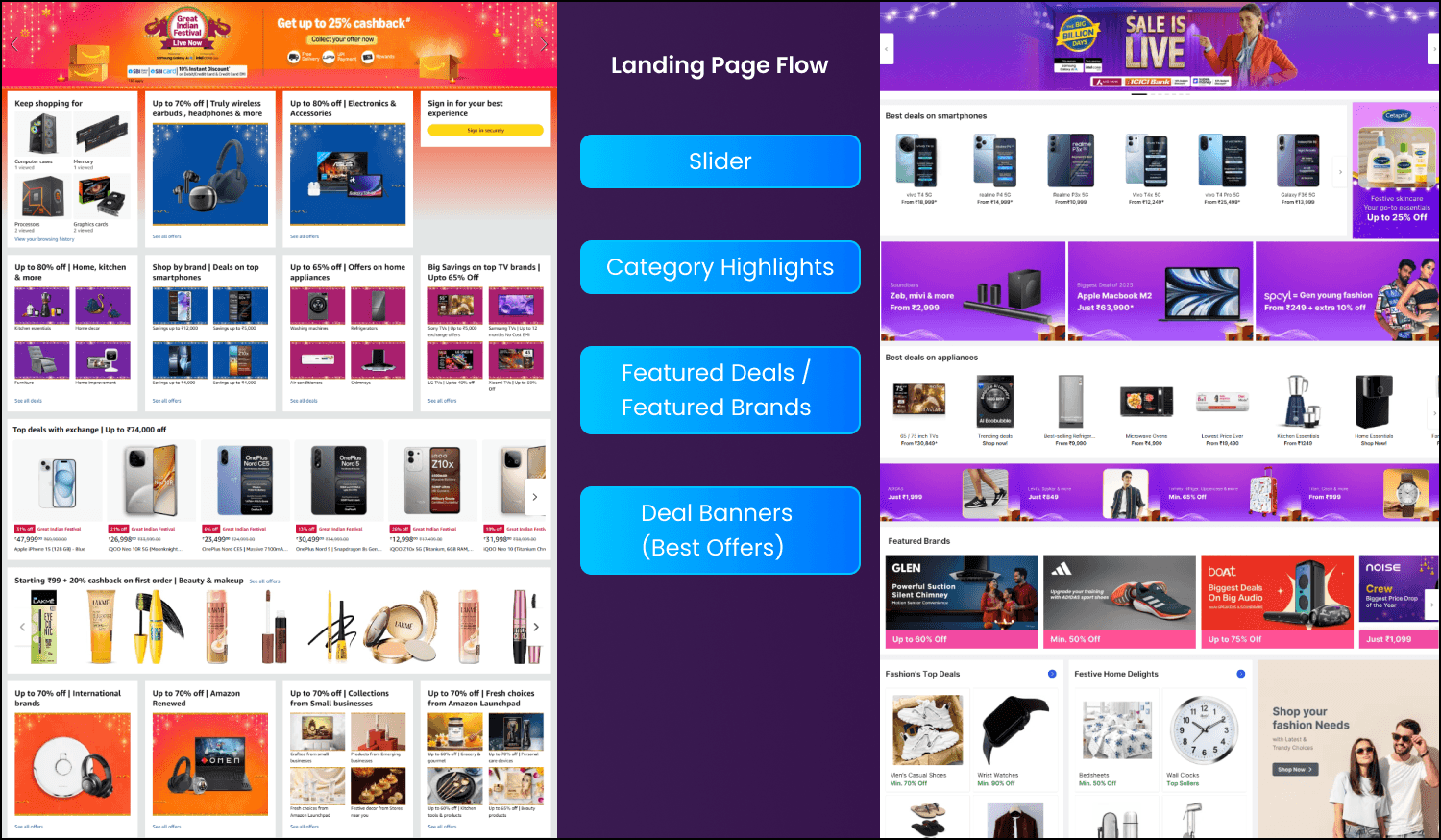
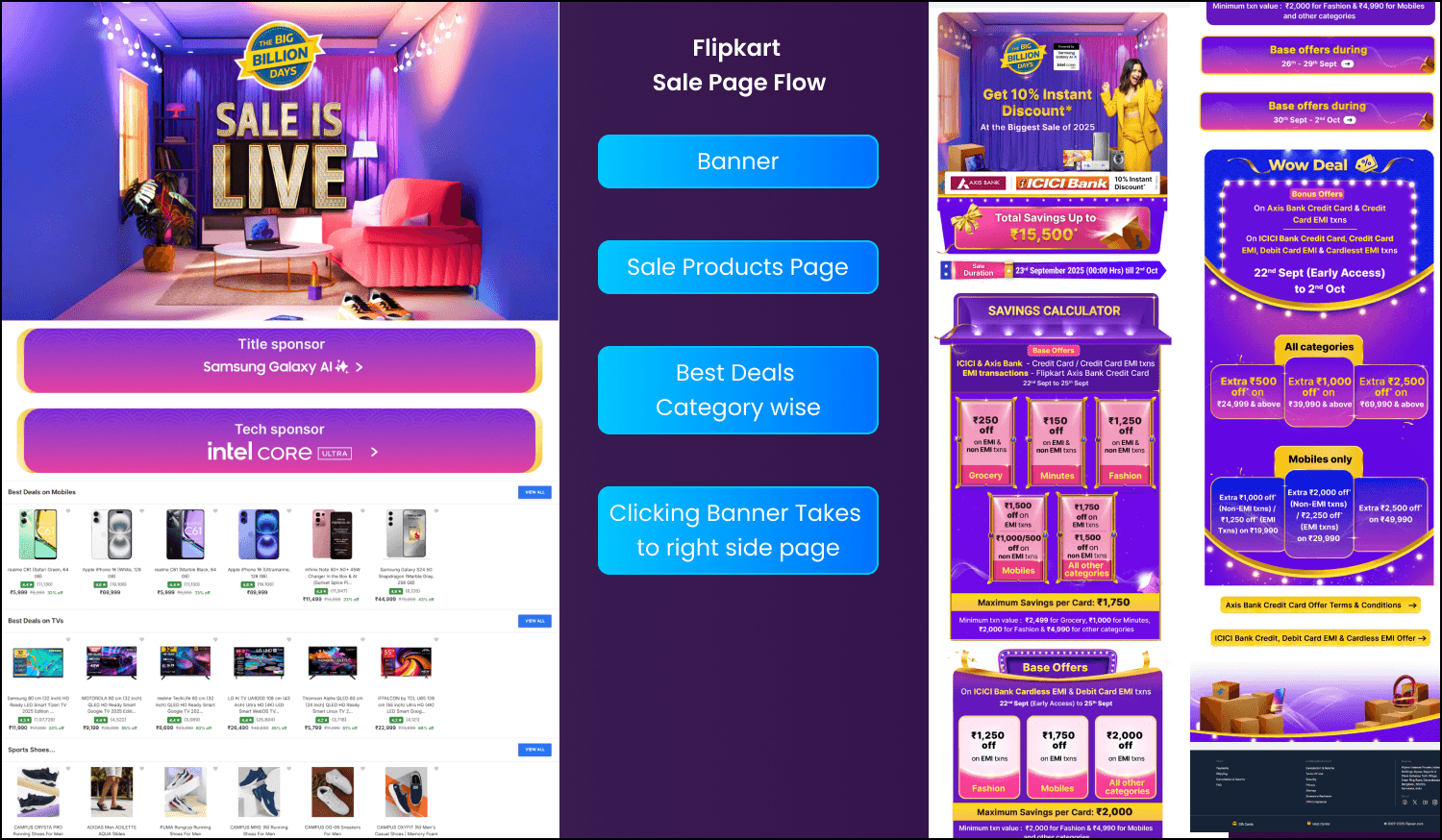
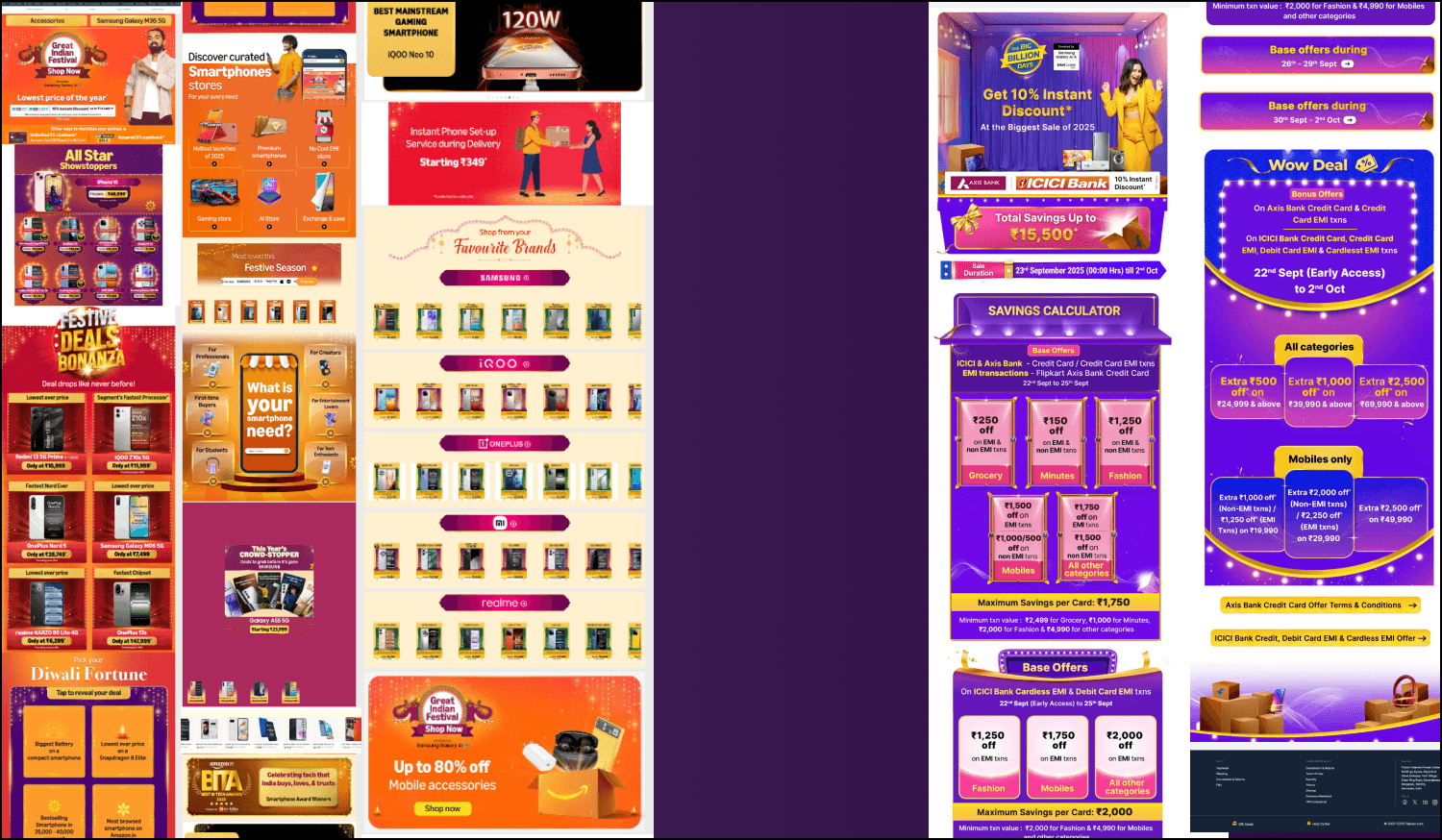
Flipkart
On Flipkart’s landing page, the sale banner leads to another page with a larger sale banner and sponsor tags, followed by products listed category-wise. Clicking on the main banner opens the sale details page with information on discounts and bank offers. However, there is no clear visual cue indicating that the banner itself is clickable and will take users to the sale information page.
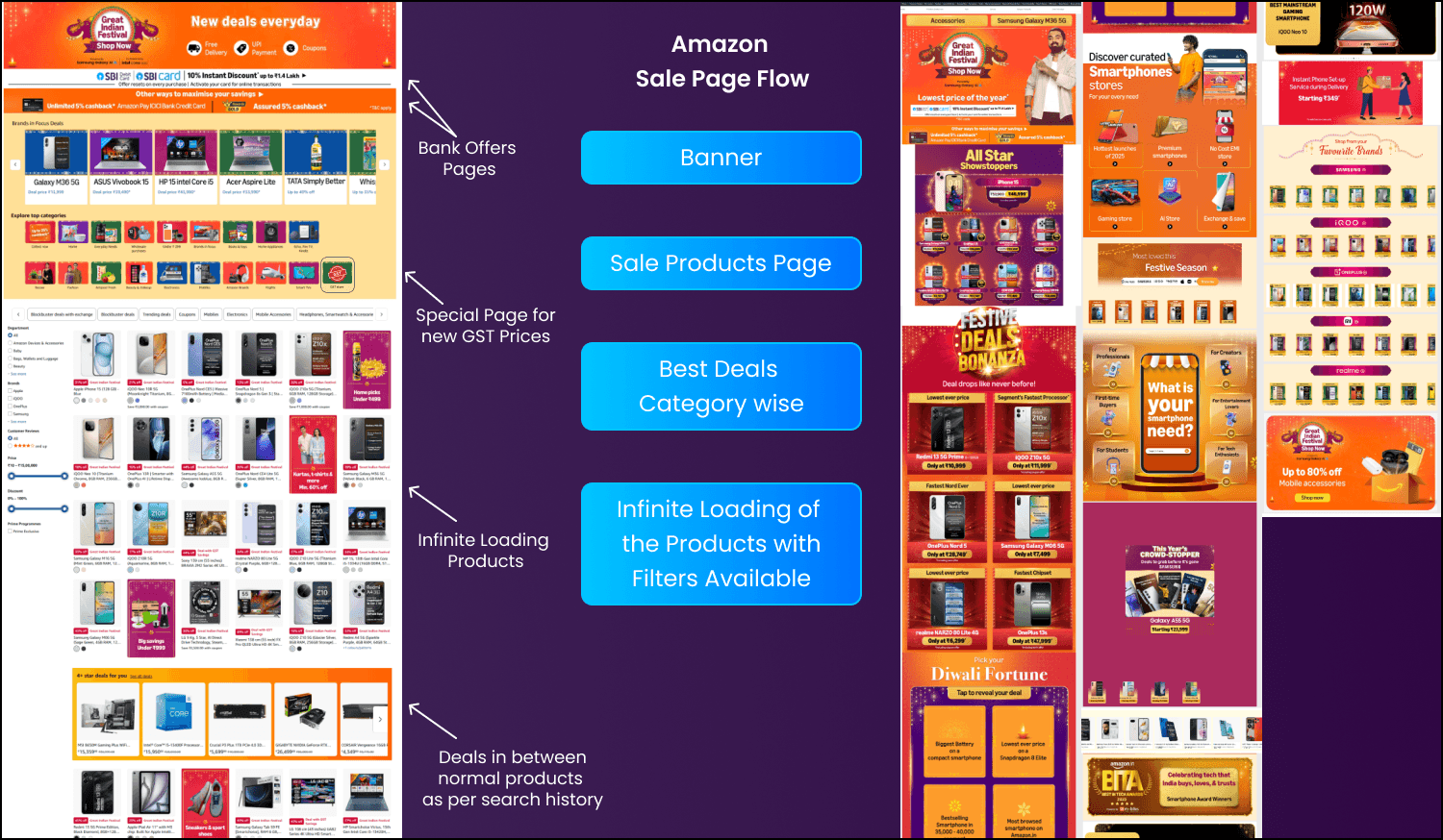
Amazon
On Amazon, clicking the banner takes users to a page with a clear sale banner and bank offers. Arrows indicate that the banner is clickable, leading to the bank offers page. Below it, small buttons highlight different deals and categories. Products are displayed with infinite scrolling, supported by tabs for categories and a filter panel on the left.
Urgency Tricks
Both Amazon and Flipkart sales are limited-time events. The real FOMO comes from the best deals that can go out of stock quickly, as seen every year when high-demand products (like iPhones during Flipkart’s Big Billion Days) often face order cancellations due to overwhelming demand.
4. Trust Marks
Amazon: “Amazon’s Choice” and “Best Seller.”
Flipkart: “Flipkart Assured”.
Both highlight easy returns and safe payments.
5. Accessibility
Amazon supports multiple languages like Hindi and provides consistent filters that make navigation easier.
Flipkart is expanding regional language options such as Tamil and Telugu to reach more users.
User Interface (UI)
During sales like Amazon's Great Indian Festival and Flipkart's Big Billion Days, both platforms retain their default UI themes for product pages to ensure user familiarity and smooth navigation. However, their sale details pages stand out with creative elements like vibrant banners, countdown timers, and festive-themed visuals, enhancing engagement while keeping the core UX intuitive.
Amazon and Flipkart focus on a mobile-first design for their sale pages during events like the Great Indian Festival and Big Billion Days, as most of their users shop on mobiles. Their sale pages are made for small screens, with easy-to-use layouts, touch-friendly buttons, and quick-loading images for smooth browsing. Features like deal timers, swipeable product sliders, and clear buy-now buttons are placed for easy access, making shopping engaging and simple. This mobile-focused approach ensures a great experience for users hunting for deals on their phones.
Amazon vs Flipkart
Both Amazon and Flipkart have their own style of designing sale pages for events like the Great Indian Festival and Big Billion Days. They have talented designers and UX teams who make shopping easy and smooth, especially on mobiles, with clear layouts, quick-loading pages, and simple navigation. I've shopped on both, and there's not much to pick between them—both are great in their own way. They focus on making the experience good for users with attractive deals, clean designs, and easy-to-use features. In the end, it’s all about what the customer wants, and both deliver well without much to compare.
Problems I Found
Too many pop-ups and banners? -
During big sales like Amazon’s Great Indian Festival and Flipkart’s Big Billion Days, you see a lot of pop-ups and banners, but it’s understandable since they’re pushing the best discounts. Both call these events festivals, so it makes sense to use bright, creative banners and catchy pop-ups to grab attention. The colorful designs and festive vibes get you excited and point you to the top deals. Sure, they can feel a bit much, but they’re made to keep the shopping fun and make sure you don’t miss out on great offers.
Product Page Issue
Flipkart
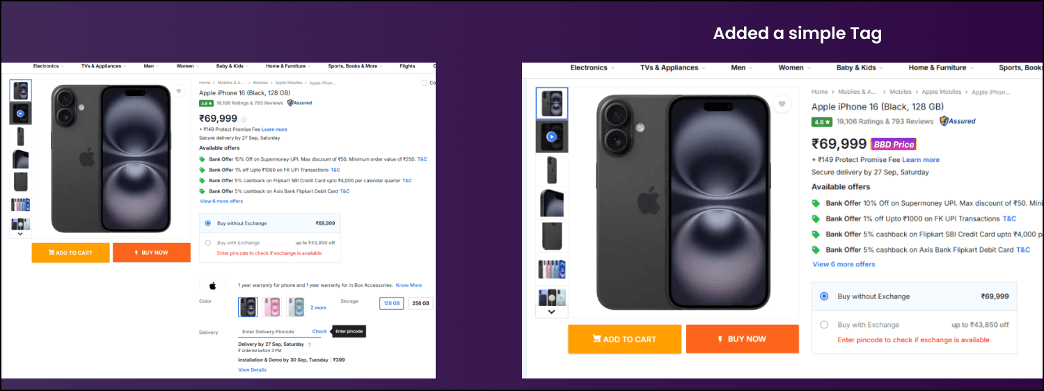
When checking product pages on Flipkart during the Big Billion Days sale, I noticed it’s hard to tell if the listed price is actually the BBD discount price. There’s no clear info or tag showing whether the price reflects a special sale discount or it’s just the regular price. Unless every single product is on sale during BBD, this lack of clarity can confuse buyers. Adding a simple “BBD Price” tag would make things clearer, spark user interest, and push them to buy, thinking the price might go up after the sale ends.
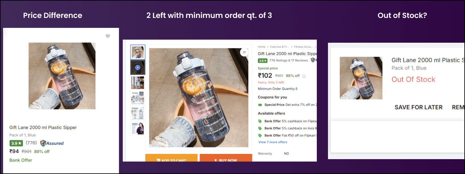
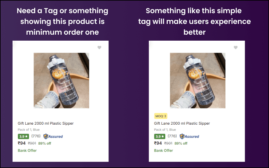
One sneaky UX issue on Flipkart is how sellers can list a product at a super low price to grab attention, but they set a minimum quantity you have to buy, like 3 or more pieces. You click on it thinking it's a steal, add to cart, and only then realize you can't buy just one—The minimum quantity tag is just a small line below the price, easy to miss at times. Plus, if the minimum is 3 but stock is only 2, it straight up shows "out of stock" instead of letting you buy what's available. Sellers set this, but Flipkart should make it clearer with bold info upfront so buyers don't get tricked into unwanted bulk purchases or miss out altogether.
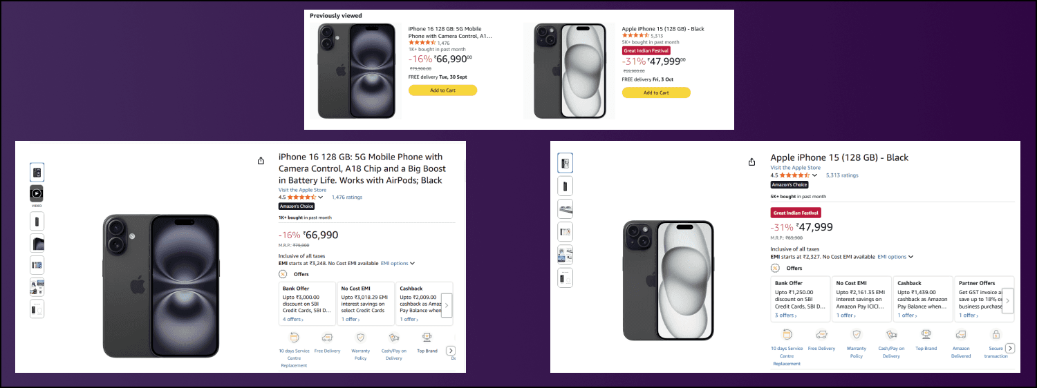
Amazon
On Amazon, during the Great Indian Festival, product pages clearly show a “Great Indian Festival” tag to indicate the sale price, making it easy to spot special discounts. For example, in the image, both products have discounts, but one has the festival tag, signaling a better deal tied to the sale, while the other is just a regular Amazon discount. This clear labeling helps shoppers understand which products offer exclusive sale prices, encouraging quicker purchases by highlighting the limited-time festival offers.
Conclusion
Amazon and Flipkart both make their sale pages for events like the Great Indian Festival and Big Billion Days lively and exciting with bright, festive designs. Their checkout process is easy and smooth, making shopping simple for everyone. Amazon focuses on building trust, quick checkouts, and suggesting products you might like, while Flipkart pushes festive vibes and urgency to grab deals fast. From this case study, it’s clear both are great at creating sale pages that pull users in. But what matters most is that customers are happy with the product they get after ordering. Both platforms keep things clear, easy to use, and offer good deals, so users love shopping on both. There’s no need to compare—they’re both awesome in their own way, and people choose based on the deals they find.