Dharma Premi Pariwar App
Redesigning the web experience into a mobile app that matches the brand but is much easier to navigate.
Year
2025
Service
UI/UX Design
Category
UI/UX Design
Tool
Figma

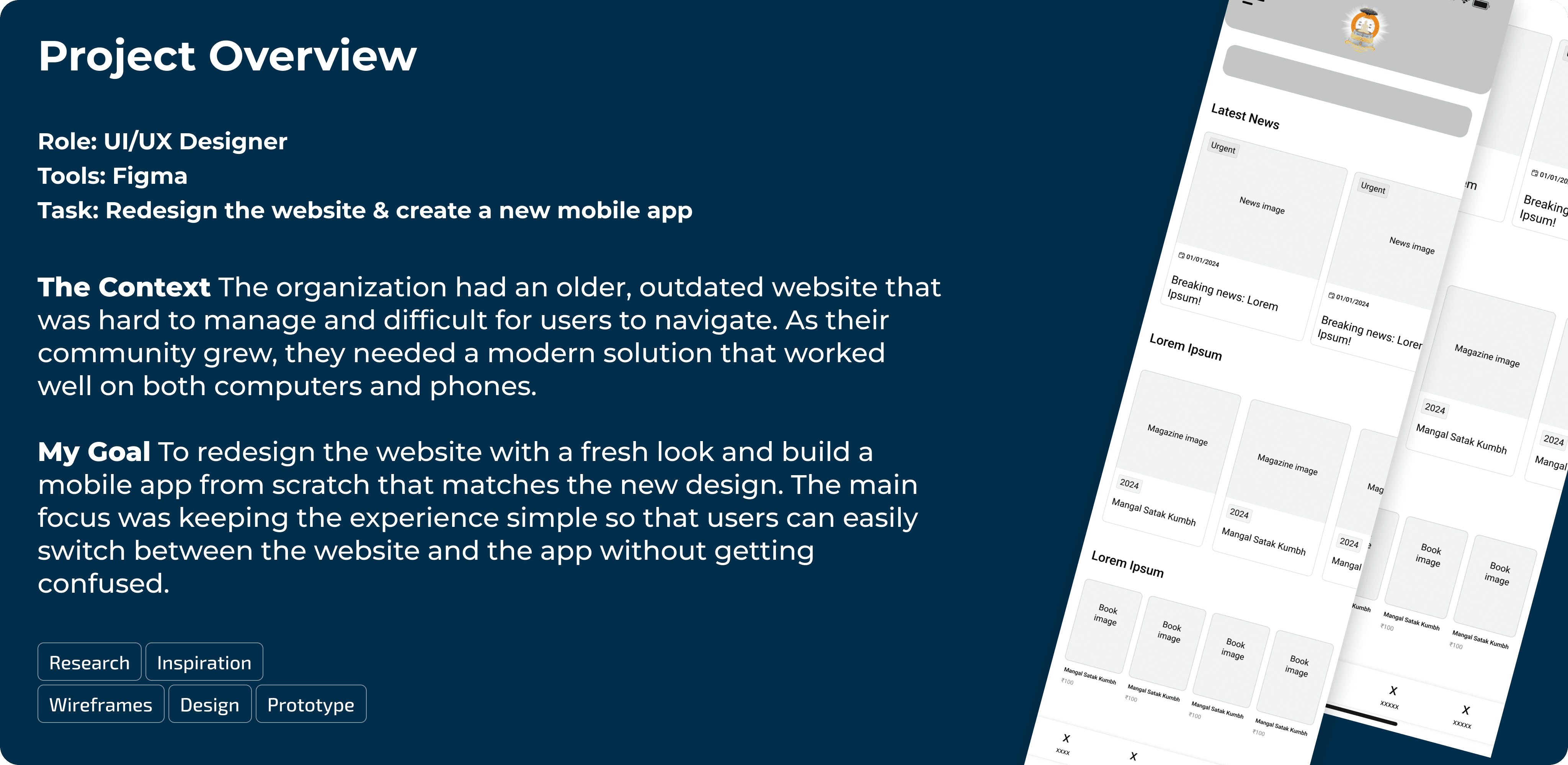
1. Project Overview
Role: UI/UX Designer
Tools: Figma
Task: Redesign the website & create a new mobile app
The Context The organization had an older, outdated website that was hard to manage and difficult for users to navigate. As their community grew, they needed a modern solution that worked well on both computers and phones.
My Goal To redesign the website with a fresh look and build a mobile app from scratch that matches the new design. The main focus was keeping the experience simple so that users can easily switch between the website and the app without getting confused.
2. The Problems (Old Version)
Before my redesign, the previous platform had several issues:
Inconsistent Design: The layout looked old and didn't match modern standards.
Hard to Use: Finding books or magazines took too many clicks.
No Mobile App: Users had to rely on the mobile browser, which wasn't optimized for reading long articles.
3. The Solution
I created a unified design system for both the Website and the App.
01. Visual Consistency (Web & App)
I ensured that the Website and the App look like they belong to the same family.
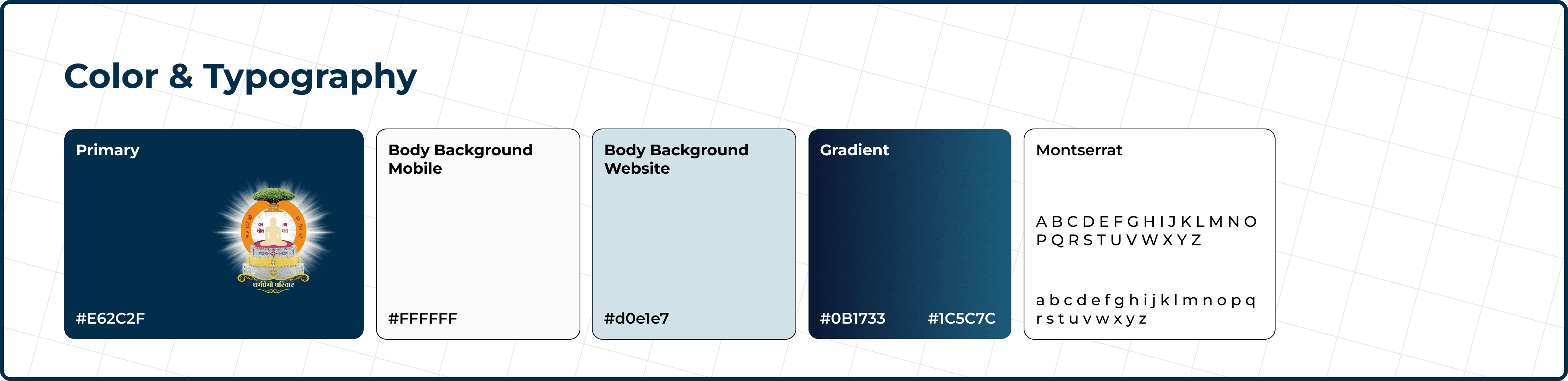
Colors & Fonts: I used the same Orange (Saffron) and Navy Blue palette across both platforms.
Why: If a user visits the website and then downloads the app, they immediately feel familiar with the interface.
The colors were chosen to complement the logo. Since the logo has a lot of detail and contrast, I selected a color that highlights it effectively while also creating a visually appealing brand palette.
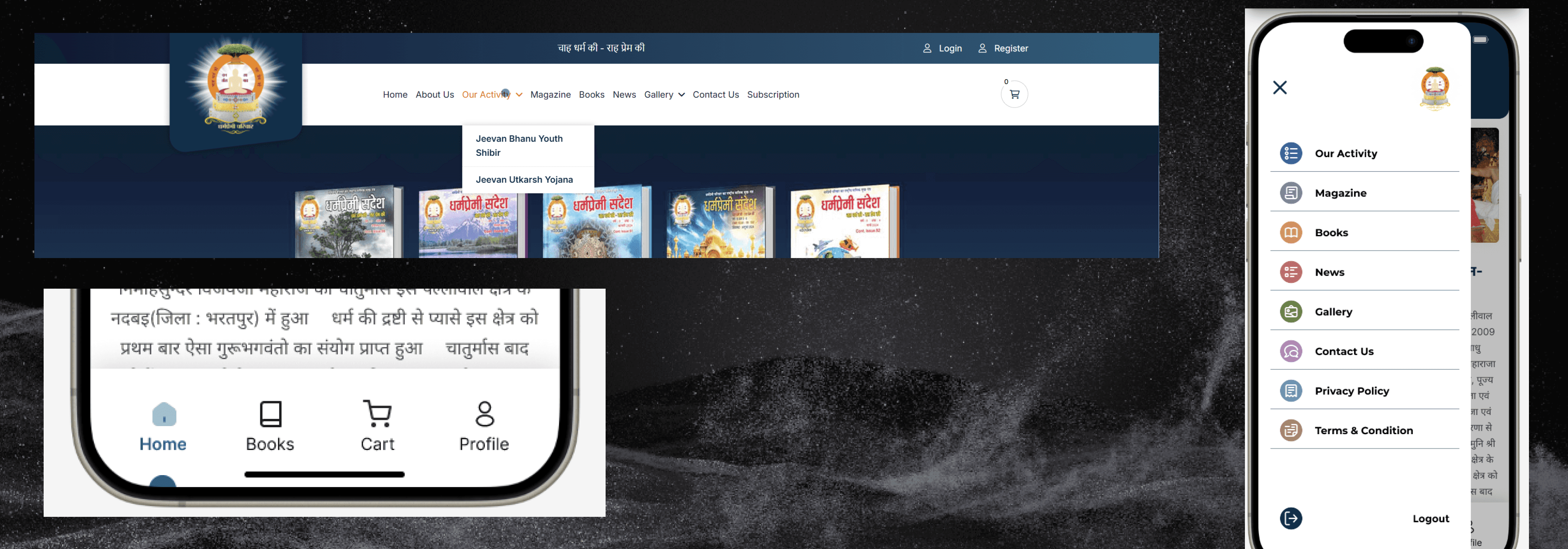
02. Simplified Navigation
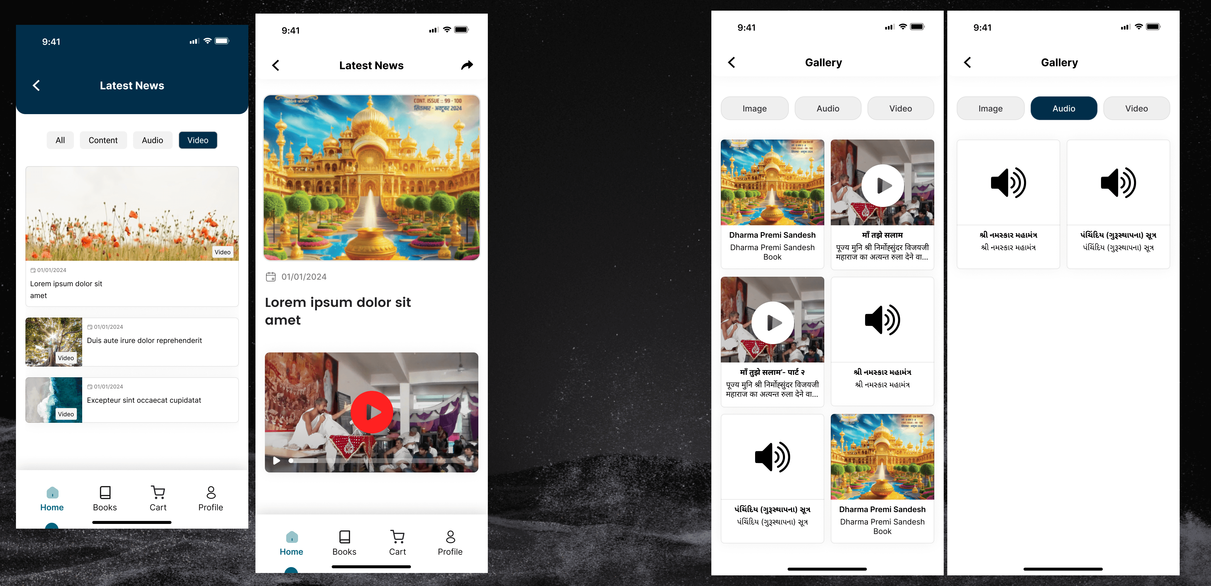
Website: I cleaned up the header menu so users can find "Shibirs" (Camps) and "Magazines" quickly.
Mobile App: I used a sticky Bottom Navigation Bar and a Hamburger menu for the app. This makes it easy to use with one hand, whereas the website uses a standard top navigation bar suitable for mouse clicks.
03. Smart Content Layout
The Challenge: The client has a lot of content (Videos, Audio, Books).
My Fix: I organized the content into clean "Cards" and "Grids." On the website, these grids stretch to fill the screen. On the mobile app, they stack vertically so scrolling is smooth.
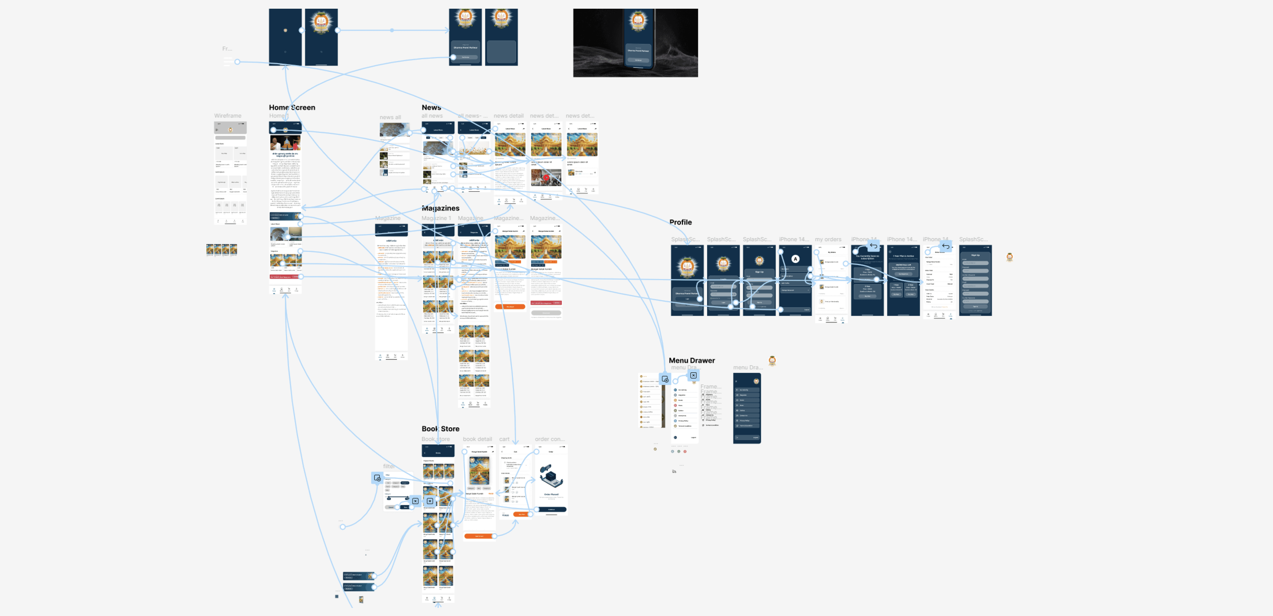
4. Inspiration & Wireframing
I started by gathering references for clean, content-focused apps. To speed up my workflow, I used AI tools to generate initial layout ideas and explore different ways to organize the content. Once I had a clear direction, I created simple low-fidelity wireframes to map out the user journey without getting distracted by colors.
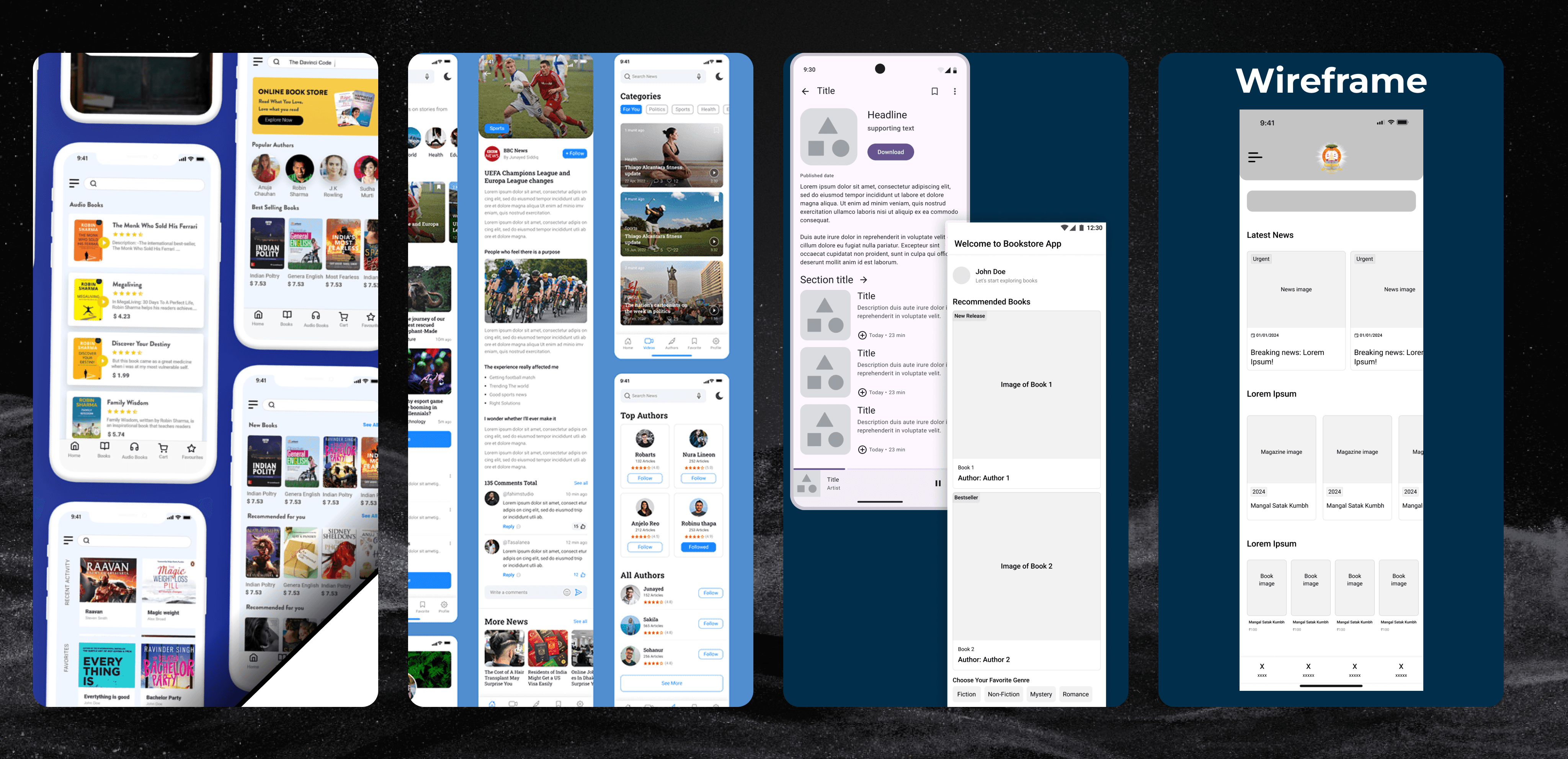
5. Design System & Components
To ensure consistency across the app, I built a modular design system. I defined the typography , color palette, and created reusable components like buttons, input fields, and content cards. This made the high-fidelity design phase much faster and easier to manage.

Development & Implementation
I didn’t just design the interface; I also brought the website to life using code.
Tech Stack: I developed the responsive website using HTML, CSS, and JavaScript.
Key Feature (Magazine Reader): I wrote custom JavaScript to create an interactive "Book Flip" effect. Instead of just scrolling through a PDF, users can flip the magazine pages digitally, mimicking the feeling of reading a physical book.
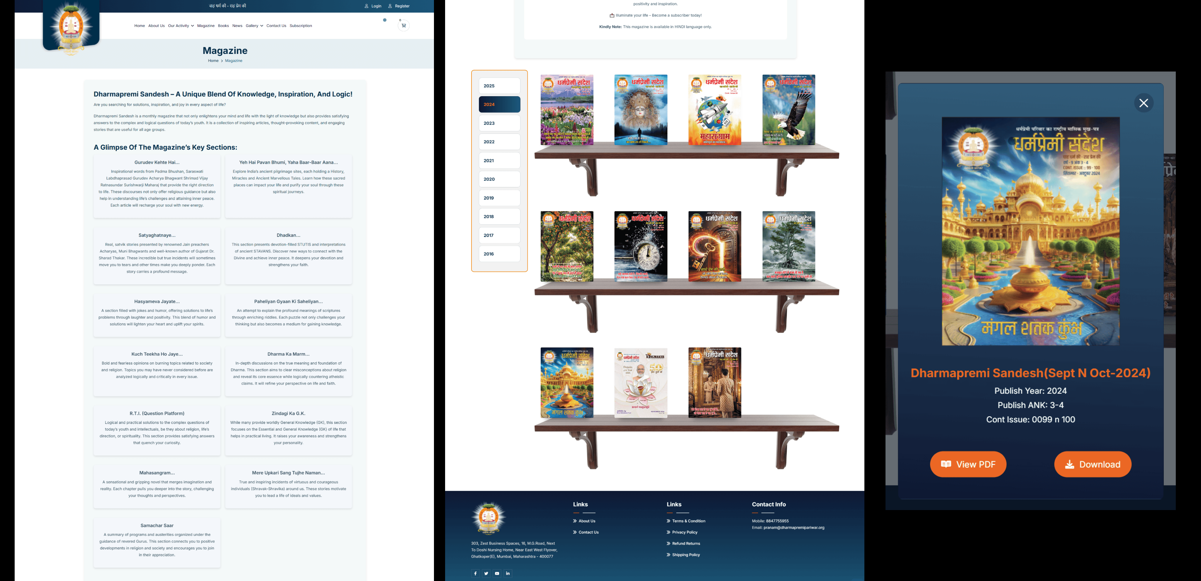
For the magazine archive, I wanted to move away from boring standard lists.
Visual Design: I designed a skeuomorphic "Bookshelf Structure" where magazine covers sit on virtual wooden shelves. This mimics the feeling of picking a book from a physical library, making the browsing experience more engaging.
The Modal Interaction: When a user clicks a cover, a detailed Modal pops up offering two options: "View PDF" (Flipbook) and "Download."
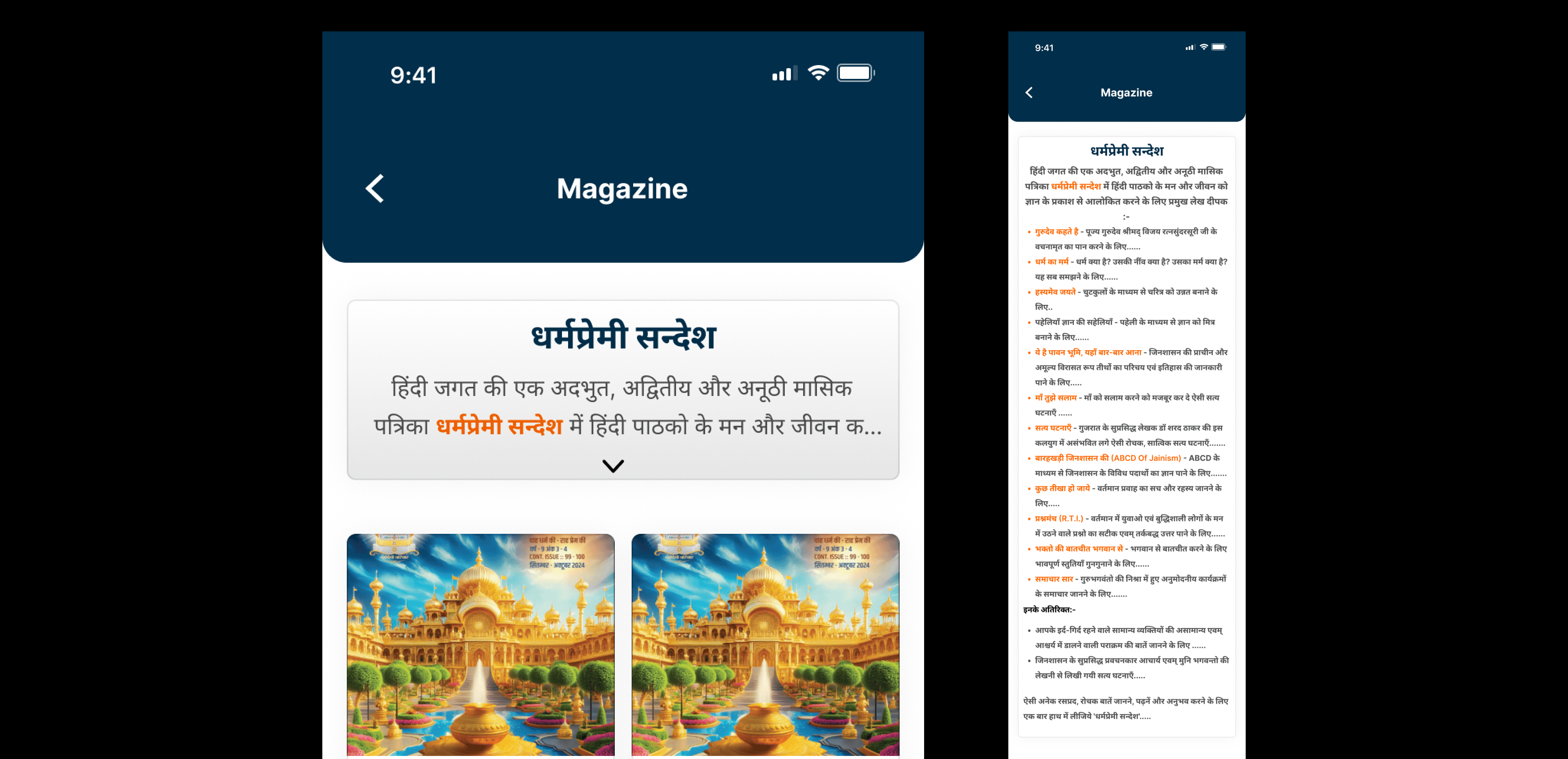
One specific challenge on the mobile app was the lengthy introductory text for the Magazine section.
The Problem: The Hindi introduction was too long. If displayed fully, it pushed the actual magazine covers down, forcing users to scroll before they could see any products.
The Solution: I implemented an Expandable "Accordion" Card. By default, users see only a small snippet of the text. I added a clear "Down Arrow" interaction that allows interested users to tap and read the full description, while keeping the interface clean for everyone else.
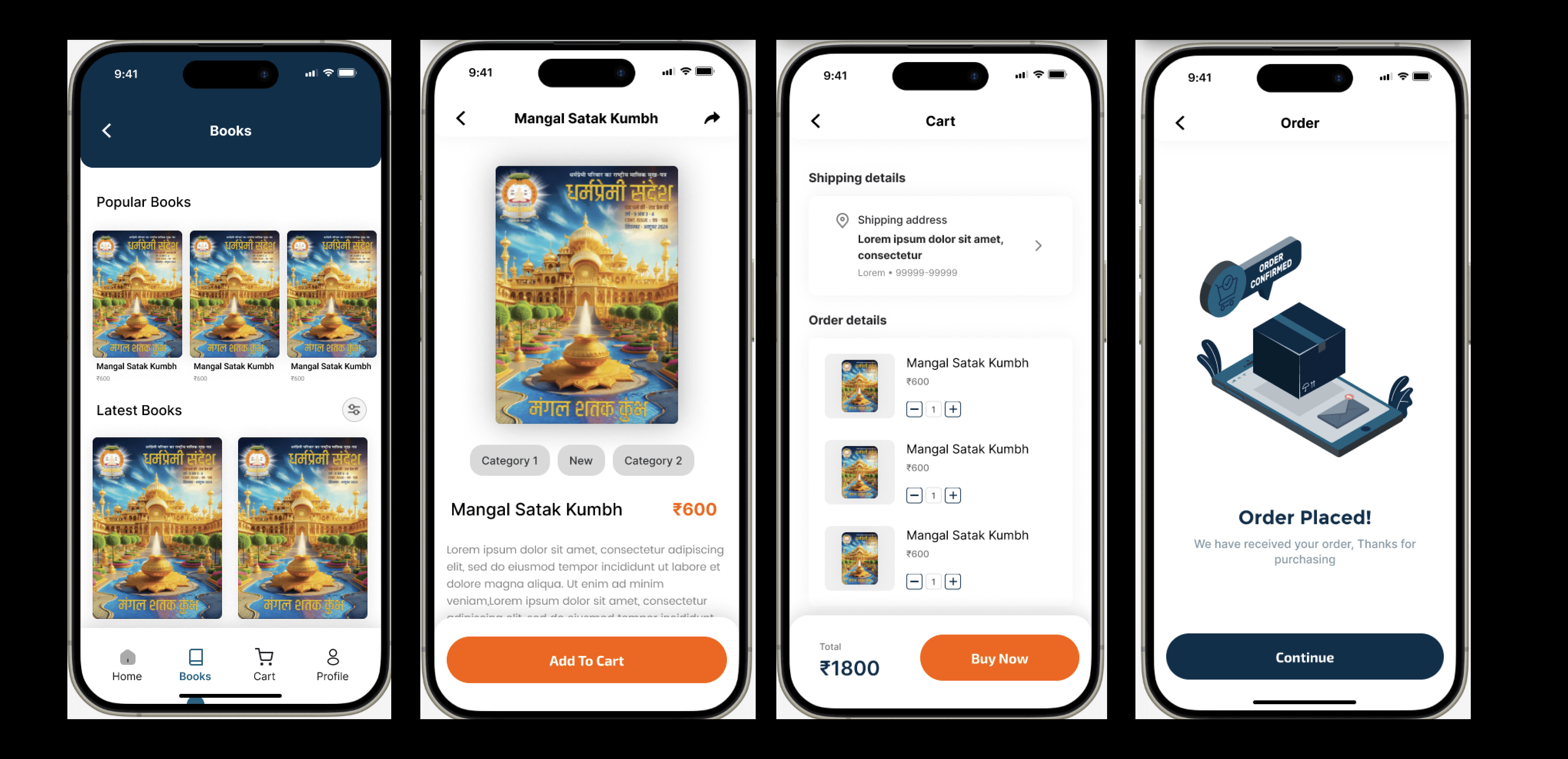
The Book Store & Checkout Flow
Beyond content consumption, the app needed a seamless E-commerce experience for selling spiritual books.
The Challenge: Making the checkout process feel secure and simple on a mobile device, especially for users who might be buying online for the first time.
The Solution: I designed a linear, 4-step flow:
Discovery: A clean grid layout with clear pricing and "Popular" tags.
Decision: A product detail page with a large cover image and a sticky "Add to Cart" button that stays within thumb reach.
Review: A distraction-free Cart screen to review items.
Confirmation: A delightful "Order Placed" success screen that gives immediate feedback, assuring the user their transaction worked.
User Account & Subscription Management
To support the community aspect, I designed a robust profile section where users can manage their digital life.
Distraction-Free Onboarding: The Login and Sign-up screens use a deep navy background to focus attention solely on the input fields, reducing drop-off rates during registration.
Self-Service Dashboard: I created a centralized "Profile" hub where users can track their book orders and manage magazine subscriptions without needing to contact support.
Subscription Cards: Instead of a boring table, I used large, tappable cards for subscription plans (1 Year vs. 5 Years), clearly highlighting the duration and price to aid decision-making.


https://play.google.com/store/apps/details?id=com.dharmapremipariwar&pli=1

The Results
By treating the website and mobile app as a unified ecosystem, we transformed how the community interacts with spiritual content.
Unified Brand Identity: The organization now presents a consistent, professional face across both web and mobile platforms.
Reduced Friction: Key actions like "Buying a Book" or "Reading a Magazine" are now intuitive and require significantly fewer clicks.
Accessibility: The mobile-first approach ensures that the app is inclusive, serving the older demographic just as effectively as the youth.
Conclusion & Learnings
This project taught me the value of Holistic Design. It wasn't just about making a "pretty app" or a "functional website"—it was about ensuring that users could switch between devices without friction.
I learned that small UX decisions—like locking magazine downloads to encourage sign-ups or using sticky buttons for easier purchasing—can have a massive impact on user engagement.